Volunteering provides physical and mental rewards, but finding volunteer opportunities can be a frustrating process, involving multiple web searches and volunteer websites.
It would be easier to bring volunteers and organizations together if all of the information was in one place. I set out to try and find a solution to this particular problem while applying all aspects of the UX design process.

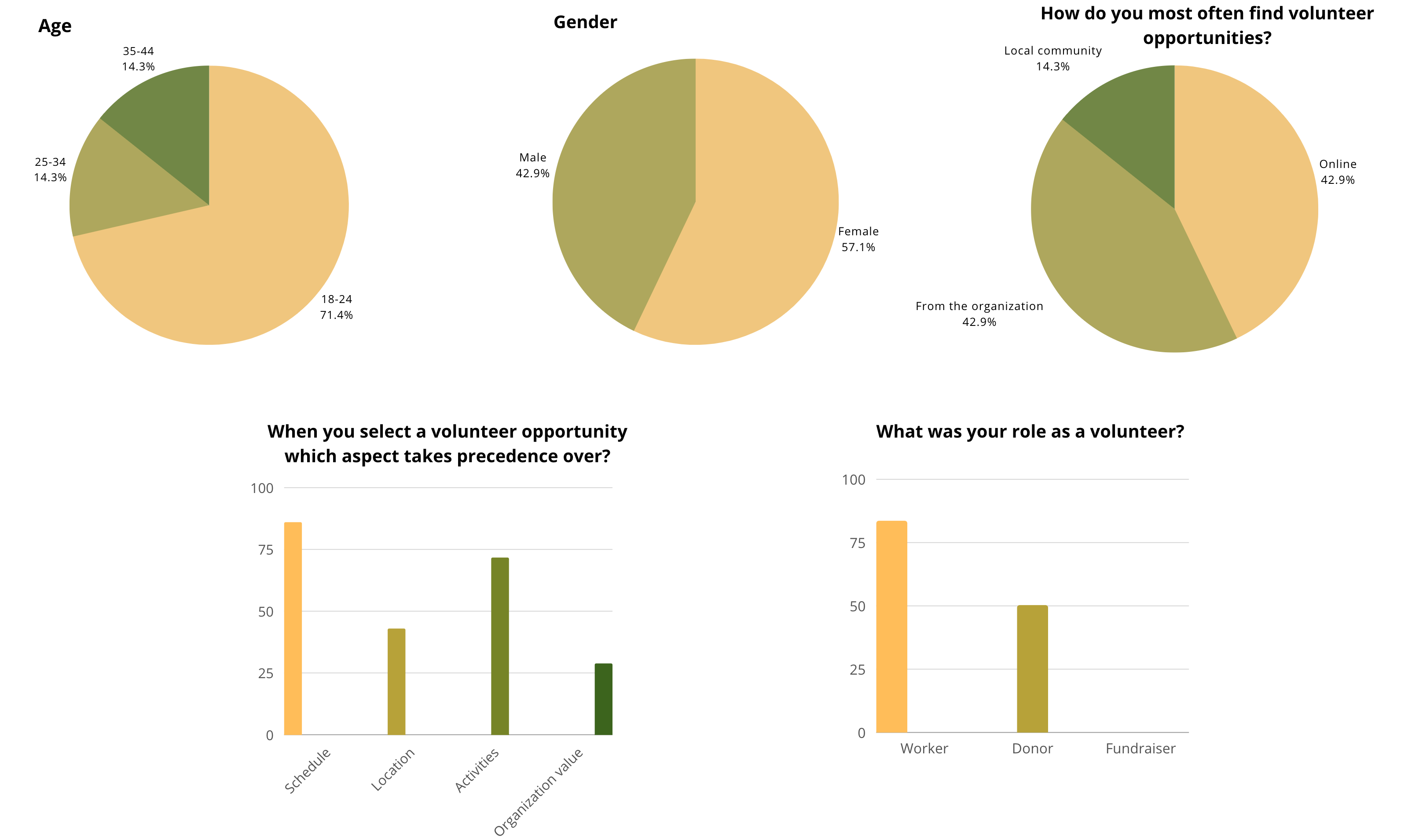
First of all, I conducted an online survey. I asked people about their behavior when looking for a volunteering opportunity such as how they most often find volunteer opportunities, what was their role as a volunteer and when they select a volunteer opportunity which aspect takes precedence over etc.
Here is what some of the users said when asked about the challenges they face when looking for volunteering opportunities.


Next, I create a user journey map to map all the doing, thinking, feeling, challenges, and opportunity on each step the user takes when using the app.

From the user journey map, I conclude the fundamental problems the users have are as follows:
I created a top priority features chart to set out the features that the users need the most while also considering the feasibility in terms of time and resources I have.

I developed a site map to arrange the features that I found from the top priority features chart . This map is handy to build a functional hierarchy and way-finding inside the website. I divided it into five main areas: About us, Projects, Events, Organizations, and User Profile.

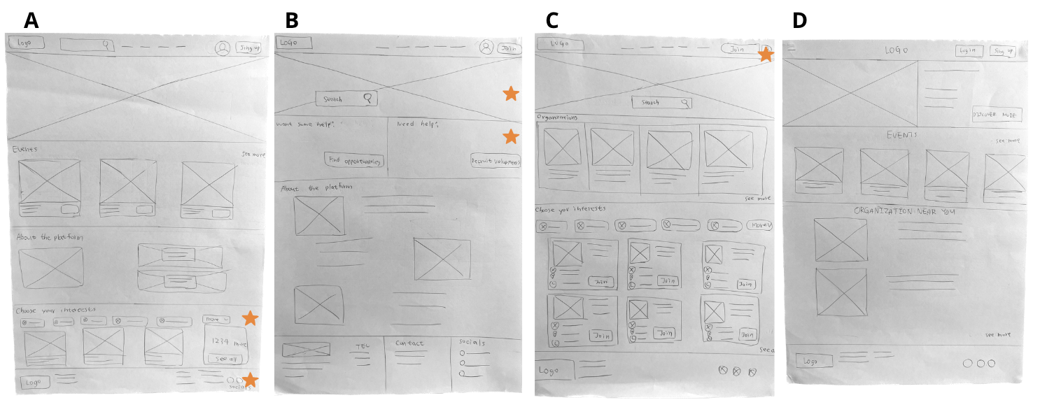
By developing 4 versions of the homepage( A, B, C and D), the final wireframe was extracted, by bringing together all of the starred elements.
As the initial design phase progressed I made sure the design was based on user feedback and research.
I used Figma for the development of my wireframes. Developing low fidelity wireframe before making the high fidelity helps me get the big picture and narrow the scope of the design.


I learned that specific text used in the searching process; or the small elements such as the color of a button, have a large impact on usability overall. Going forward, I would improve and spend more time on individual elements, i.e. developing organization managers and volunteer user account dashboards.


%402x.svg)