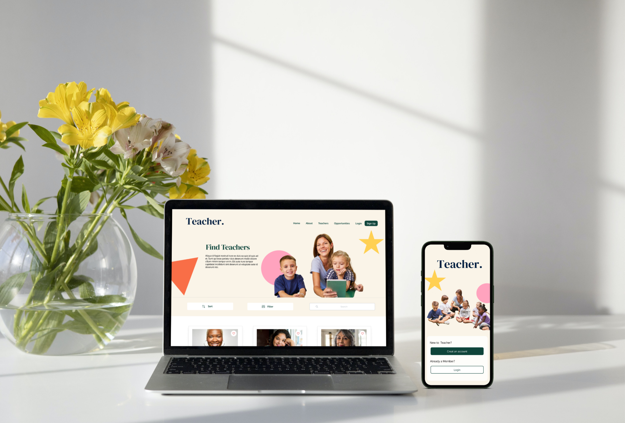
Teacher is a mobile app and website designed to address the challenge of finding substitute teachers and enhance employment opportunities for substitutes. Additionally, it offers a community platform for connecting with other teachers.
The process of finding substitute teachers is currently spread across various platforms, requiring a significant amount of time. Additionally, it proves challenging to identify substitutes who can align with both the required time and qualifications simultaneously
Design Teacher mobile app and website to be a user-friendly all-in-one platform by including clearer navigation, sign-up options, clear categories and search filters. Where full-time teachers, substitute teachers, and kindergartens can find teachers and job opportunities easily, It also provides a community to connect with other teachers.
To identify problems that exist in finding a substitute teacher or substitute job opportunity, I conducted an online survey with questions to discover the dilemma and challenges behind a user's looking for a substitute teacher or substitute job opportunity.
After surveying a total of 38 people and analyzing their responses, I discovered three main challenges that users face when they find a substitute teacher or substitute job opportunity.

The user persona below, LI-AN, represents a fictional, yet the realistic description of a user. This aims to further empathize with the user through with design process.
LI-AN, has been created in response to research; from surveys and understanding pain points.

This user journey map follows LI-AN's journey of finding a substitute teacher.
The map identifies the benefits of having search filters; reducing LI-AN's anxiety and can find a substitute teacher who can match
LI-AN's schedule more accurately.

The chart allows us to see the main flow when users sign-up.key elements include the difference between sign-up options.
.png)
After ideating and drafting some paper wireframes, I use Figma to development of my wireframes and made sure the design was based on user feedback and research. Developing low-fidelity wireframes before making the high fidelity helps me get the big picture and narrow the scope of the design.

The mock-ups below show before and after usability studies. Seeing as both usability approaches focus on different aspects, together they proved extremely helpful in implementing usability improvements.

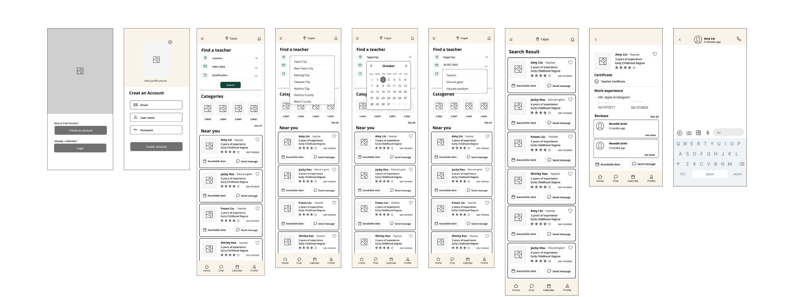
A new sign-up option has been developed based on feedback from the usability study. The new create an account includes two parts: " I am a Teacher" and " I am part of the kindergarten". Users can choose between the two options according to their requirements.

Reduce the size of the home page search box. Users clicking on the filter would open a page with rich filter types. Filtering options include categories, locations, qualifications, and dates.
The high-fidelity prototype followed the same user flow as the low-fidelity prototype, including design changes made after the usability study.

.gif)

.png)
.png)

Having completed the app designs, I began work on designing the responsive. I utilized the Teacher sitemap to guide the organization of each screen design to ensure an overall cohesive and consistent look and feel across all platforms.The high-fidelity prototype followed the same user flow as the low-fidelity prototype, including design changes made after the usability study.


I've come to realize that design is not solely about aesthetics; it should primarily cater to the user's needs. A profound understanding of the user is crucial, as is the feedback received from them. Navigating through each stage of the design process and tailoring it to the specific needs of users enabled me to formulate solutions that are both feasible and practical


%402x.svg)